The Hiring-Match UX That Turned a Wall of Filters Into a Conversation
Redesigned a hiring-match search that used to demand 4–5 conditions on one screen into a step-by-step conversational flow where the AI asks back and shows its reasoning.
The problem
On the search entry screen, recruiters were asked to specify every candidate condition (domain, role, skills, education) as free text all at once. Setting filters manually or uploading a job description filled the screen with filter chips, pushing the AI’s recommendations and conversational context further down. Result summaries were also long blocks of prose, making it hard to see at a glance how the entered conditions actually shaped the results.
Approach
“Agent UX over tool UX” — the system’s underlying logic stayed the same; the screens got radically simpler.
- Entry flow: instead of asking everything at once, redesigned it as a 3-turn conversation — core conditions → detailed skills → secondary conditions.
- Trust visualization: a fit badge at the top of each candidate card, with keywords mentioned in conversation highlighted so matching evidence is visible at a glance — full reasoning stays behind a popover on icon click, keeping the default view simple.
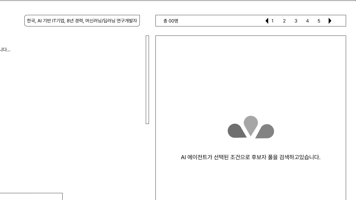
- Real-time feedback: an “Analyzing…” message with a skeleton UI conveys the AI working in real time, and messages can be sent straight from the list without opening the detail page, cutting click depth.
Diagrammed the existing and improved flows side by side to compare what changed and why, and overlaid both states (as-is/to-be) on real UI screenshots to diagnose item by item.
Delivered
- UX diagnosis report (3 as-is problems, 3 to-be strategies)
- Improved user flow diagrams (before/after comparison)
- Development-ready wireframes with interaction specs per screen element