HMI Redesign for a Batching Control System
Redesigned the operator screen for an industrial batching-control HMI — clearer status at a glance, fewer mis-clicks during setpoint entry.
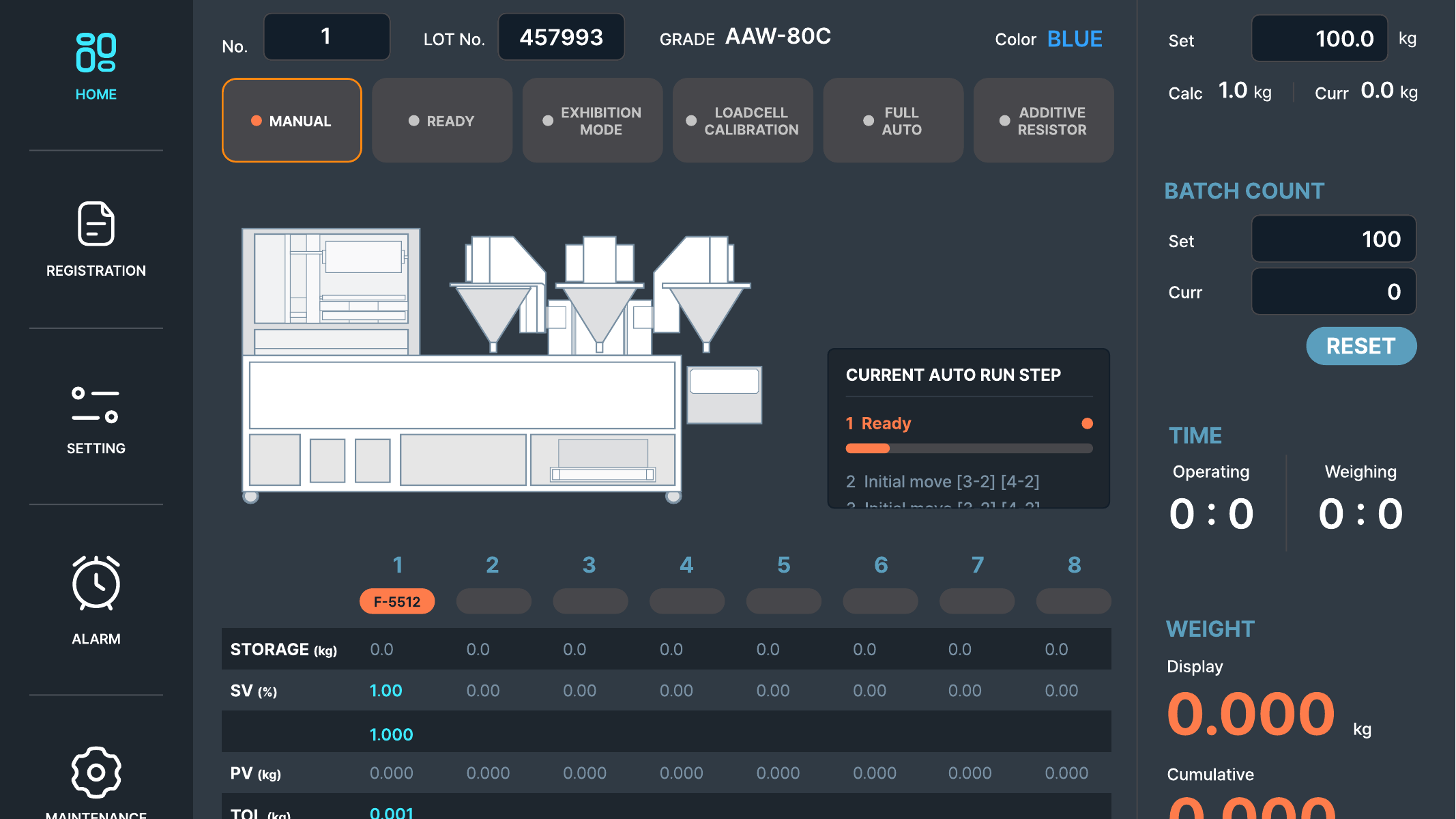
The problem
Operators run this HMI on a factory floor, often with gloves on, glancing at the screen between other tasks. The existing layout packed setpoint fields, live readings, and alarm states into a dense grid with near-identical styling, so a mis-tap between adjacent fields was common, and it wasn’t always obvious at a glance whether the system was running normally or waiting on an alarm.
Approach
- Status hierarchy: pulled run-state (idle/running/alarm) into a single, unmissable band at the top instead of a small icon buried in a table.
- Touch targets: enlarged setpoint-entry fields and added spacing between them, sized for glove-tap accuracy rather than mouse-precision defaults.
- Alarm clarity: alarm rows get a distinct color and icon treatment, separated from routine readings instead of sharing the same row style.
Worked directly from real screen captures of the existing HMI, annotating specific friction points before proposing the redesign, so the fixes map onto the actual screens operators use.
Delivered
- Annotated as-is screen audit
- Redesigned HMI screen layout
- Rationale notes per change (why each fix reduces mis-operation risk)